A real-time performance management
Problem Statement
Opportunities
Customized sub-pages
Streamlined Application Process
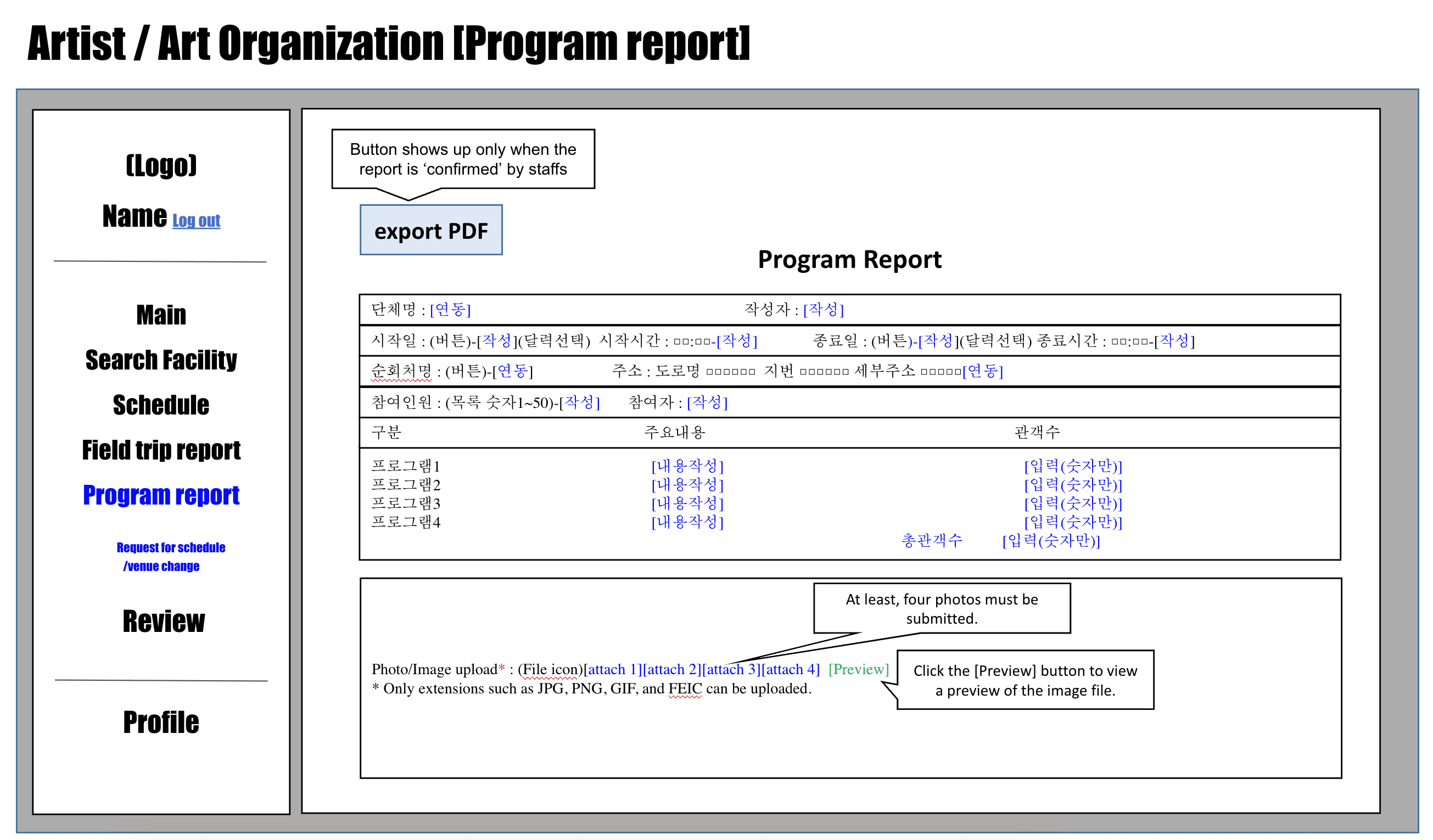
Complex and cumbersome process for accessing and coordinating performances
Current Systems lack seamlessness, making it difficult for organizers and audiences to apply for
Responsible personnel handle hundreds of daily phone calls and manage information manually
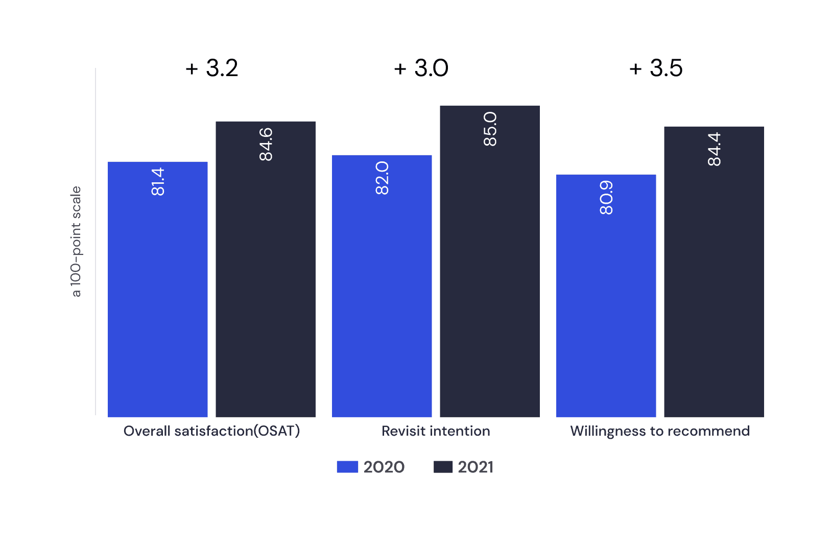
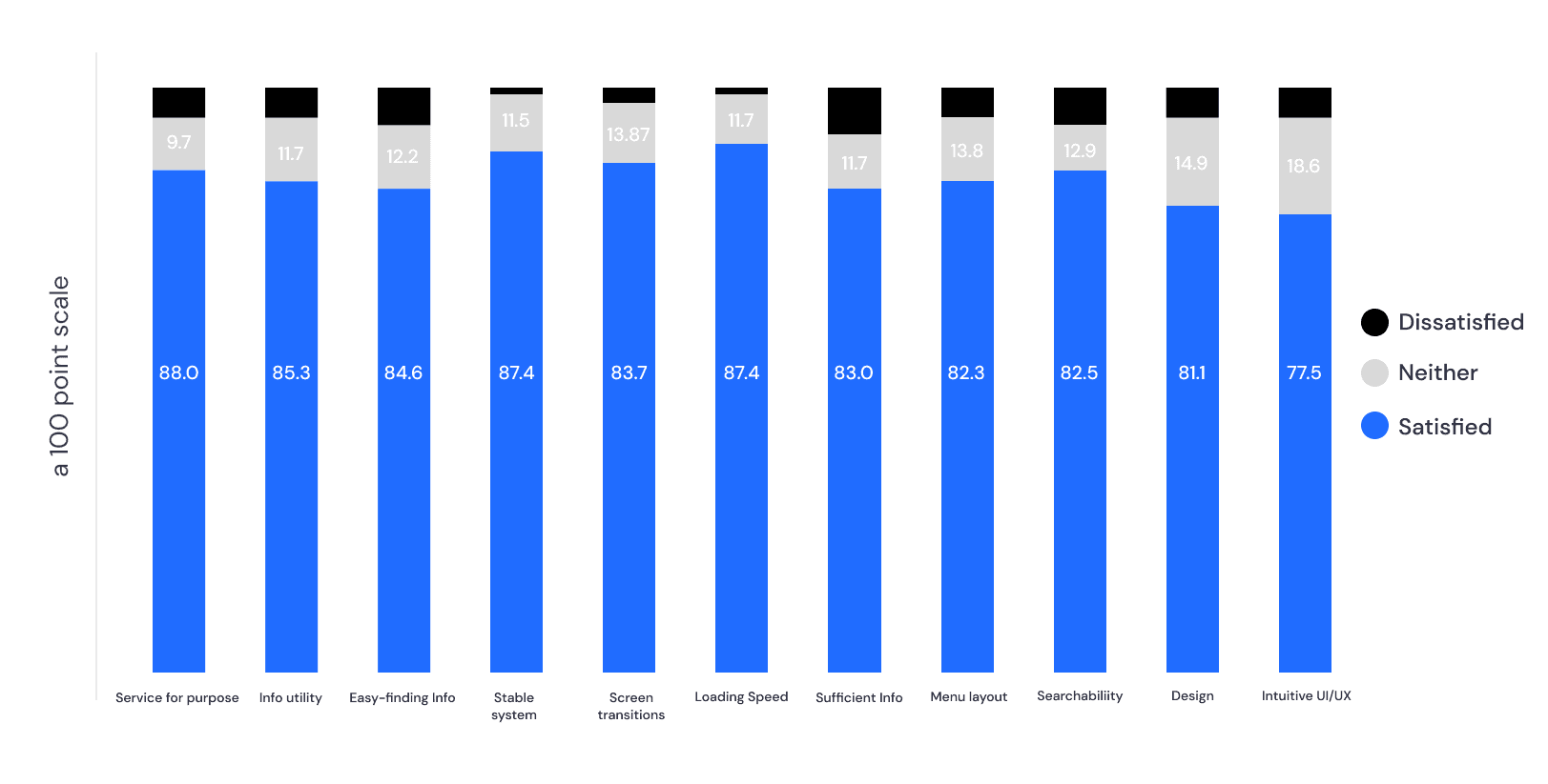
I assessed a satisfaction survey regarding the experience of using the website.
The satisfaction level regarding the suitability of the information under the specific category of the website is the highest, scoring 84.5 points.
The satisfaction level regarding the intuitiveness of the 'UI/UX' is the lowest, scoring 79.8 points.
I conducted a two-week online satisfaction survey with 435 participants, utilizing a structured questionnaire on a 7-point Likert scale. The collected feedback is instrumental in ongoing project assessment and improvement efforts.
To gain deeper insights into users' needs and pain points, we conducted user interviews across four categories: general users, artists, internal staffs, and facility managers.
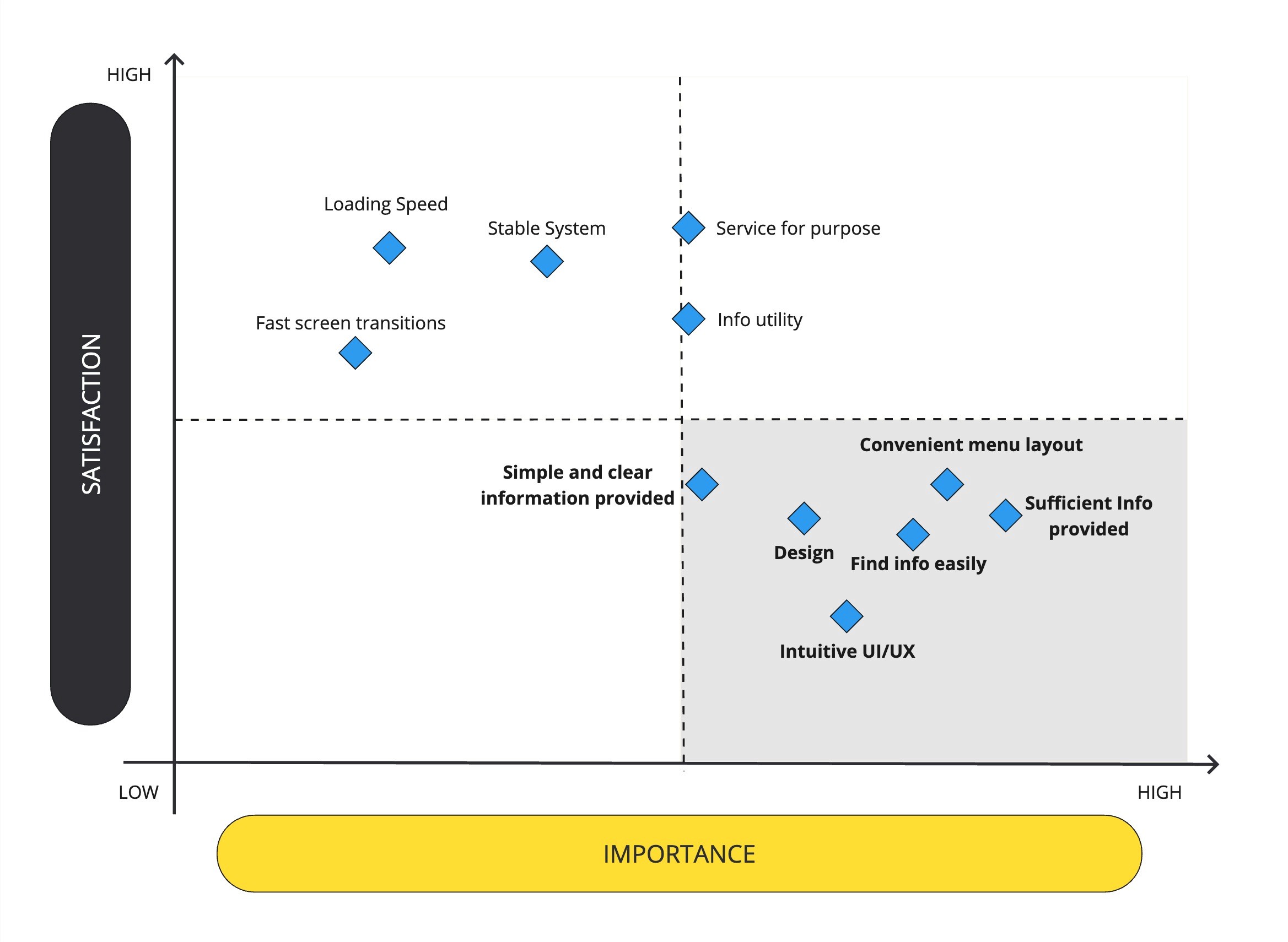
Based on responses from 435 participants, an Importance-Performance Analysis (IPA) was conducted, revealing critical areas for immediate improvement.
As a result of applying the correlation coefficient method, 'intuitive UI/UX', 'convenient menu layout', and 'lack of scattered information' were found to be the areas most in need of improvement.
Since issues related to information structure rather than design were the main focus, the focus was on how to provide a more effective information architecture.
1. Quantitative Research
User Survey
User Interview
2. Qualitative Research
3. Importance-Performance Analysis (IPA)
01 Discover
Stating problems to specify users’ painpoints would help me to find out any possible opportunities to build an feasible and efficient service.
Want to easily find performance schedules.
Need venue size and accurate descriptions.
Want to update information of the performance venue in real-time.
Sick of responding one by one through phone calls or emails.
I have conduced second rounds of design prioritization to clarify my ideas and main features. By doing so, I was able to find the most efficient and feasible solutions.
02 Define
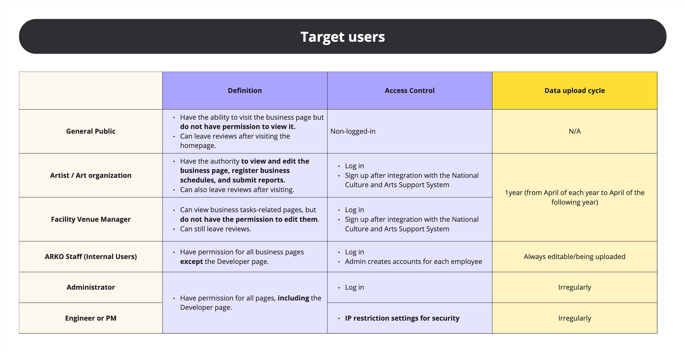
1. Target User
2. Information Architecture
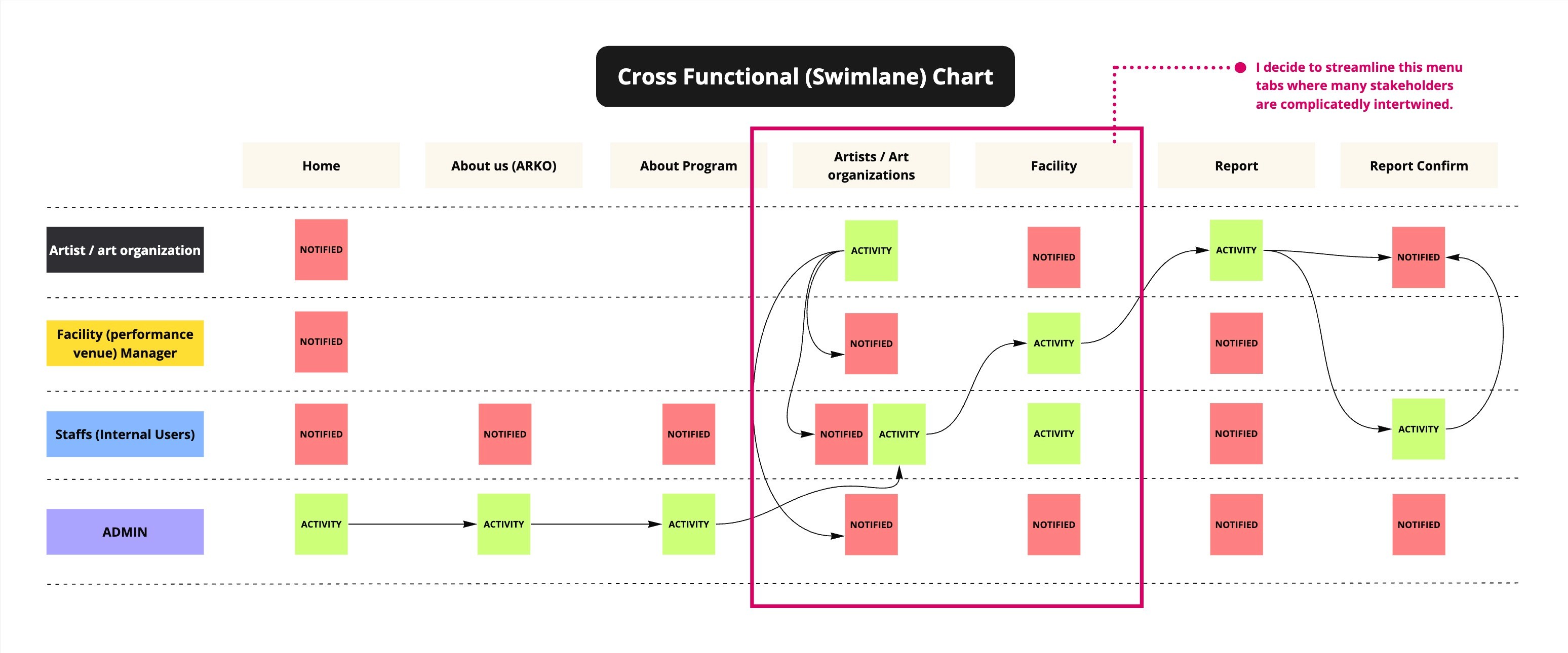
3. User flow
Based on survey and interview, I defined the target users and stakeholders for the website. Also I organized how to control the access and set the data upload cycle for each users.
In order to explore how volunteer has been committed in people’s everyday lives, we tried to utalized multiple research methods to seek for genuine information from users.
Under NDAs

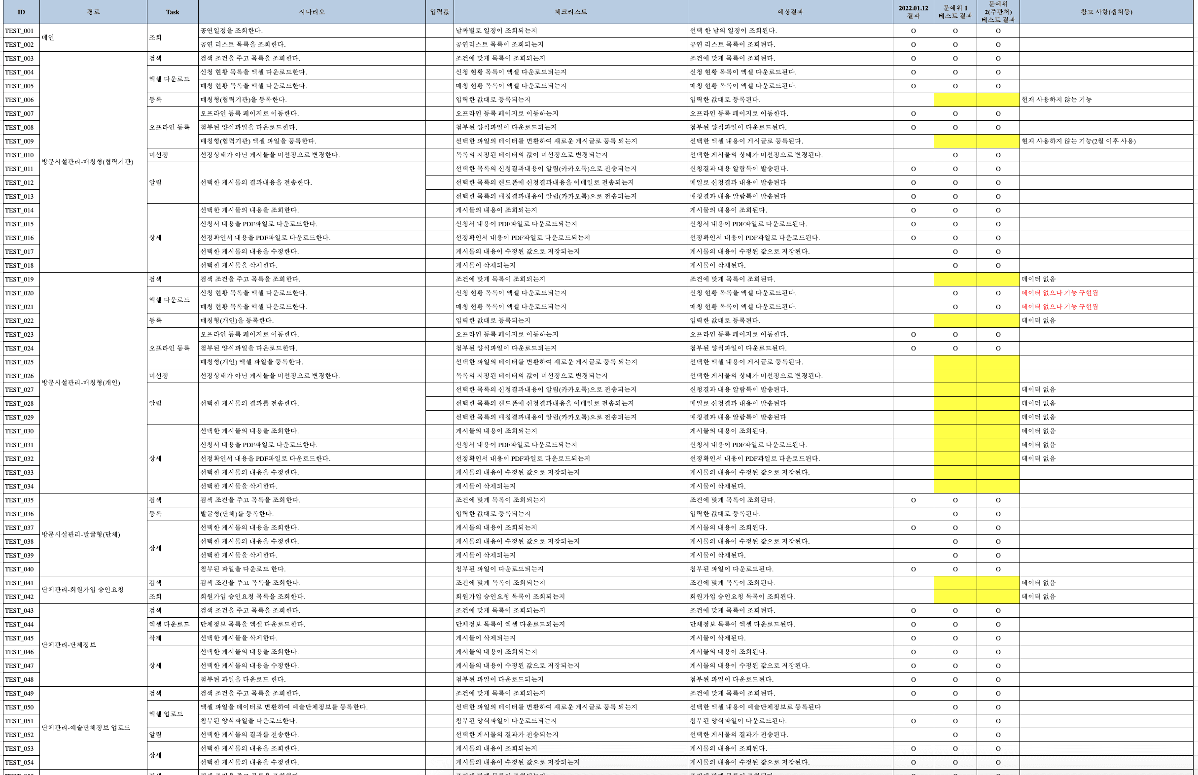
Under NDAs
Under NDAs
※ Most of the design content and IA for this project are under NDAs. So apologies if this looks very bare-bones!
I've conducted further rounds of design ranking to refine user flows and primary attributes. In this way, I discovered the most effective and workable approaches.
I advanced the designs to proceed with the necessary pages and features to cater to the requirements of the user.
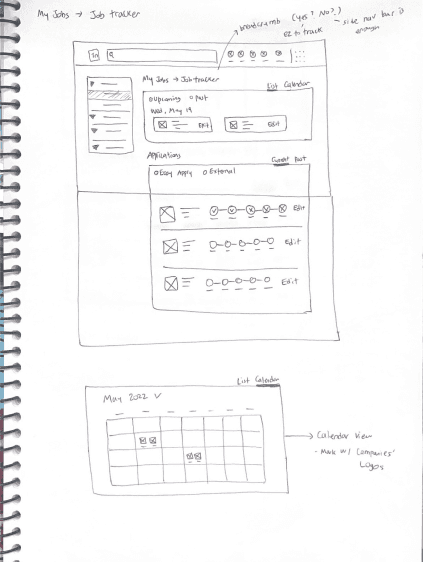
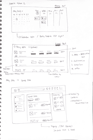
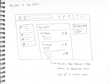
Utilizing drafts, I formed wireframings as storyboards centered on user journey, the infrastructure of the product, its functionalities, and hierarchical structure.
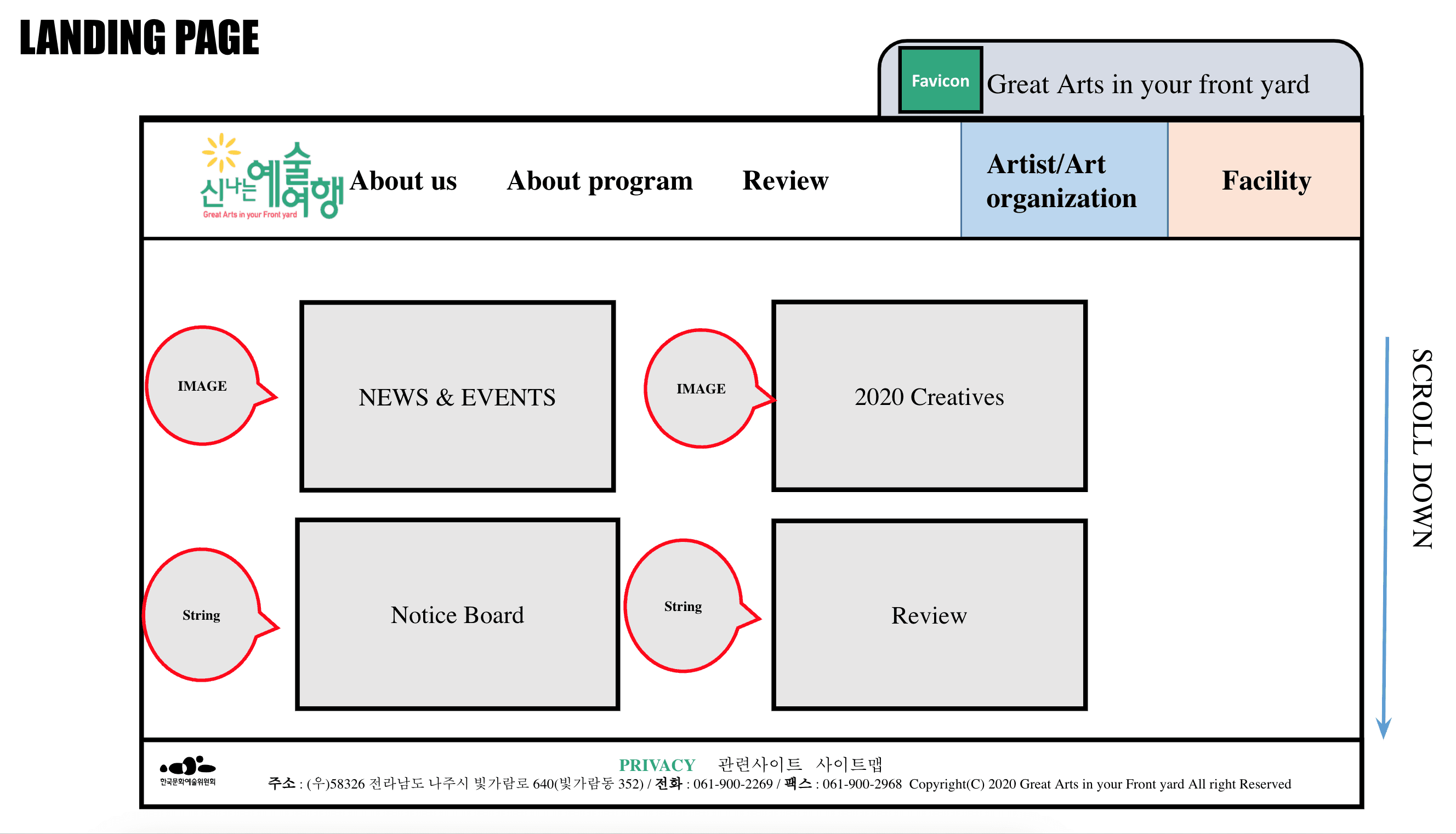
1. Sketches
2. Wireframing
03 Ideate
Based on our findings, I ideated from sketches to user flow for key frustrations, goals, and behaviours of the users.
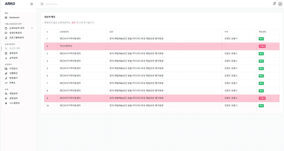
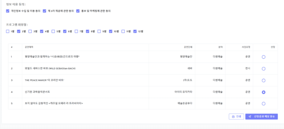
04 Design
Once the key features and information architecture has been established, I started to design the service from wireframing.
2. Visual / Graphic Design
Design Decision
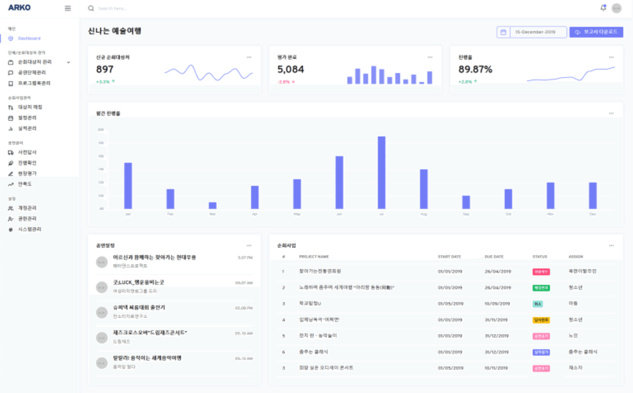
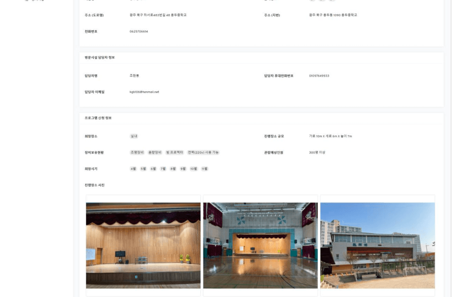
Based on the sketches and low-fidelity wireframe, I developed a high-fidelity design with the website design system.
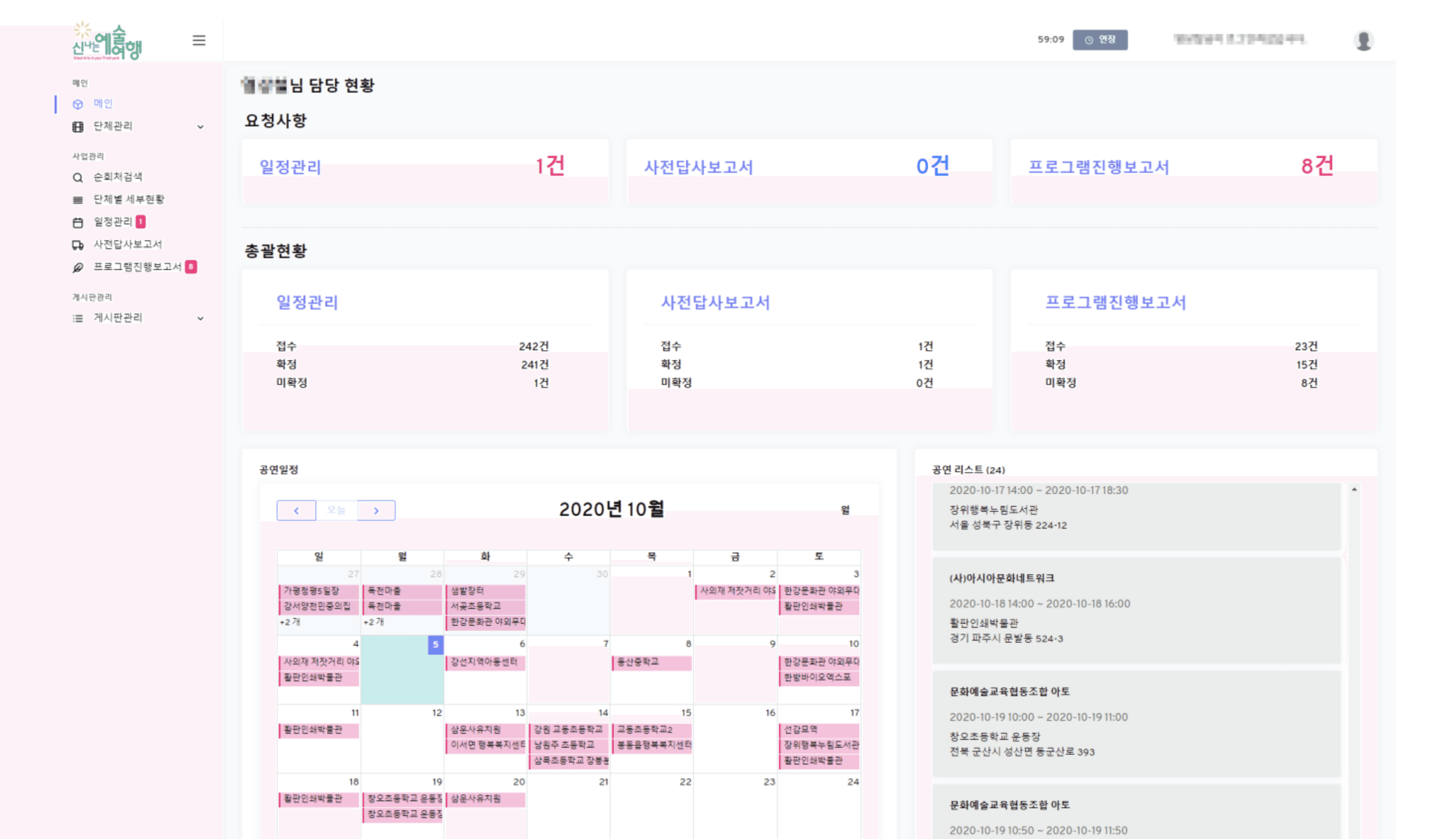
Provides Customized Calendar
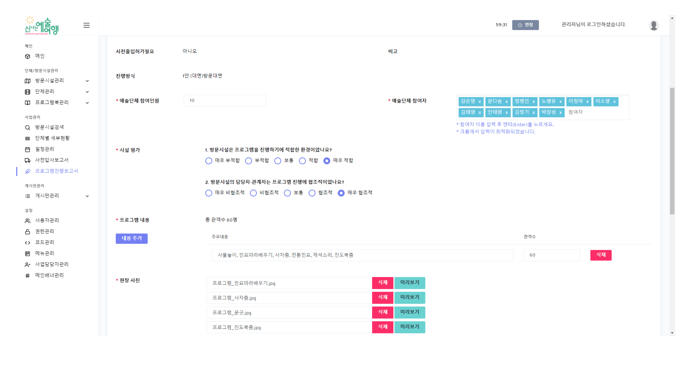
Offers a rating system for performance venues
Creates Live Streaming Function
Artist / Art production
a 5-point scale survey
HTTP Live Streaming (HLS)
ARKO Staffs (Internal users)
Validation logic
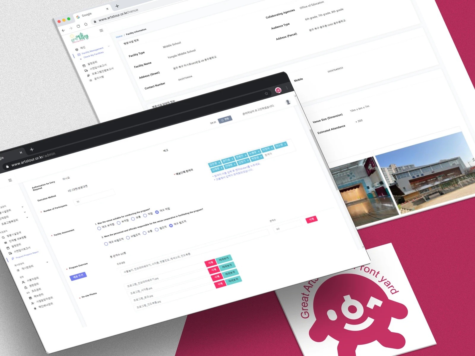
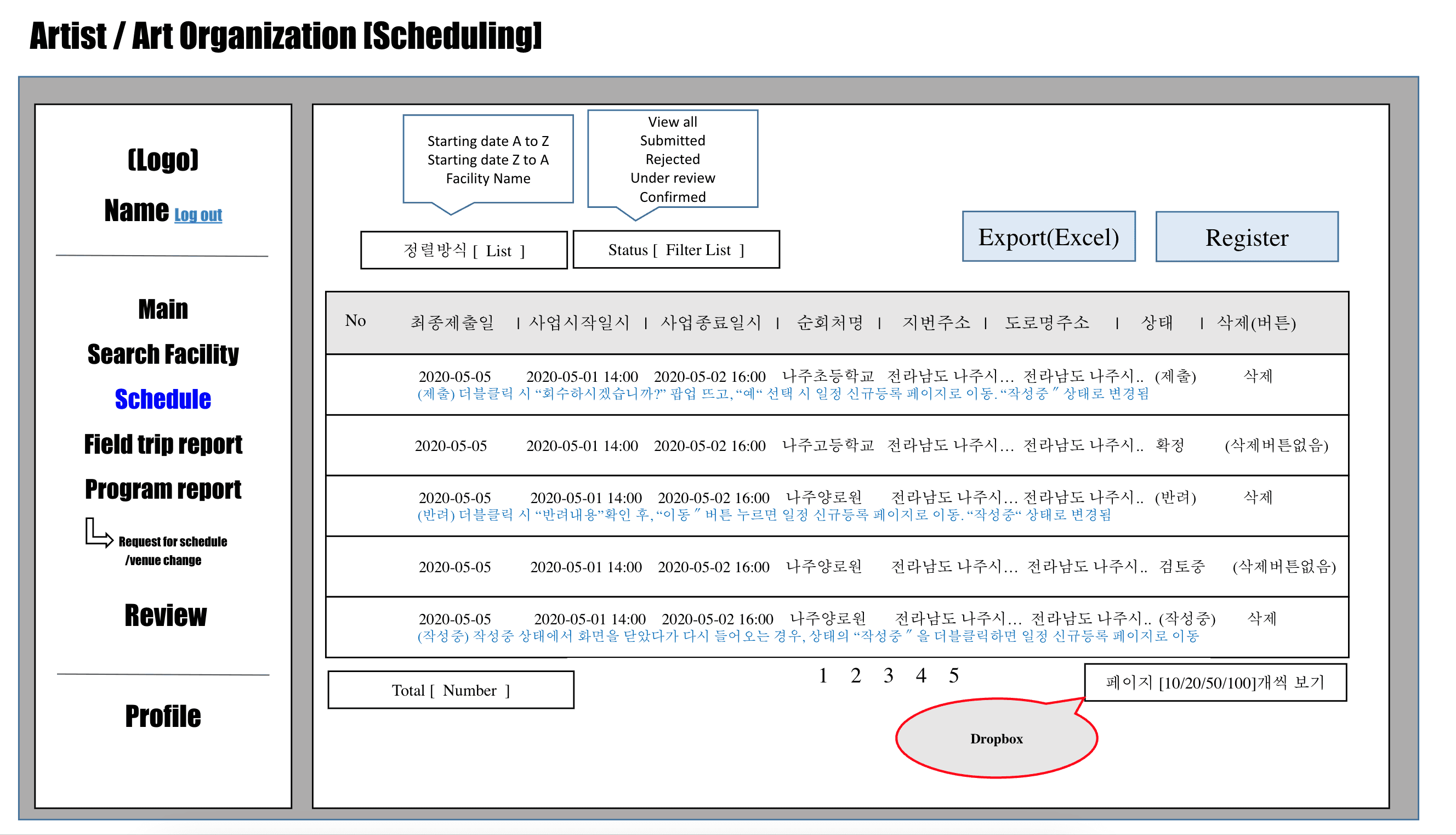
Created the Calendar for Managing Performance Schedules
Permitted appraisal by real performers for performance venue considered unreachable or inappropriate for shows
Inserted live streaming links, organizations conducting real-time performances provide convenient access for business managers and other stakeholders
Offered internet users greater convenience and accessibility
Streamlined performance scheduling
Displayed for assigned artist, arts production or facility's request all at once
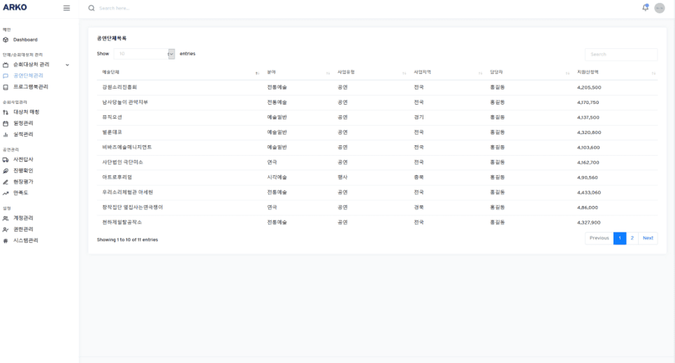
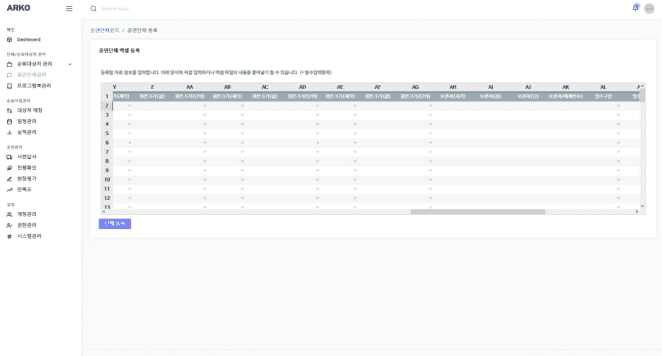
Facilitated easy management of low-rated facilities in Excel
1

1
2
3
05 Test
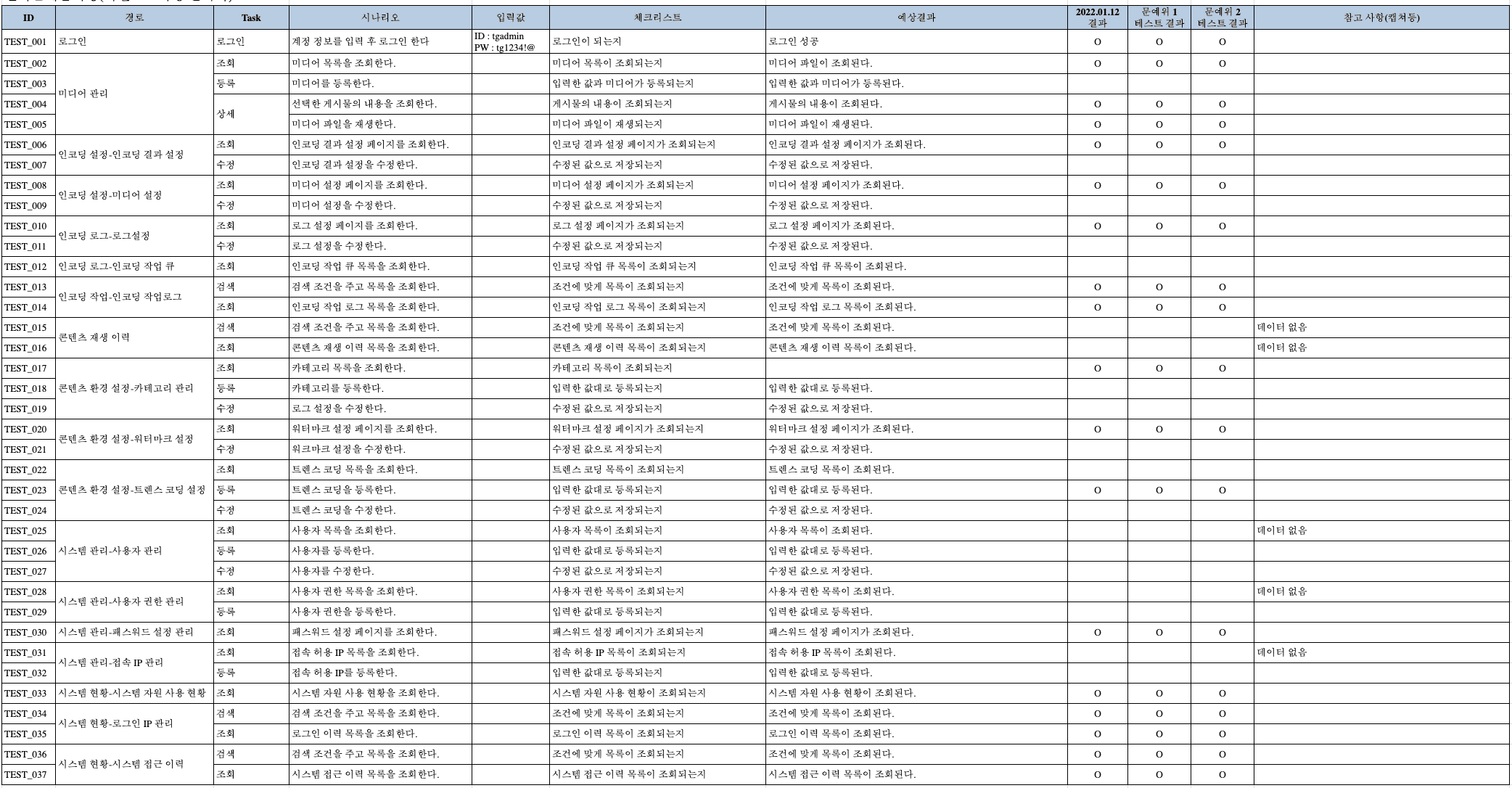
I have conducted a usability test to see how users interact with the prototype and complete given tasks.
Usability Testing
Participants can navigate to the menu they want to access.
Most participants can upload their reports, but some errors detected in input and modal issues.
Participants can browse and search for programs; however, access to some media was unavailable.
95%
Correct Navigation
Program report upload
75%
Program Search
80%
Testing Results
I conducted user testing with 13 participants, achieving a 90% task completion rate. The scenarios included public page, employee, and administrator pages, each with 25 assigned tasks, totaling 75 tasks executed.
2. Iteration
Color Contrast
Keyboard Access

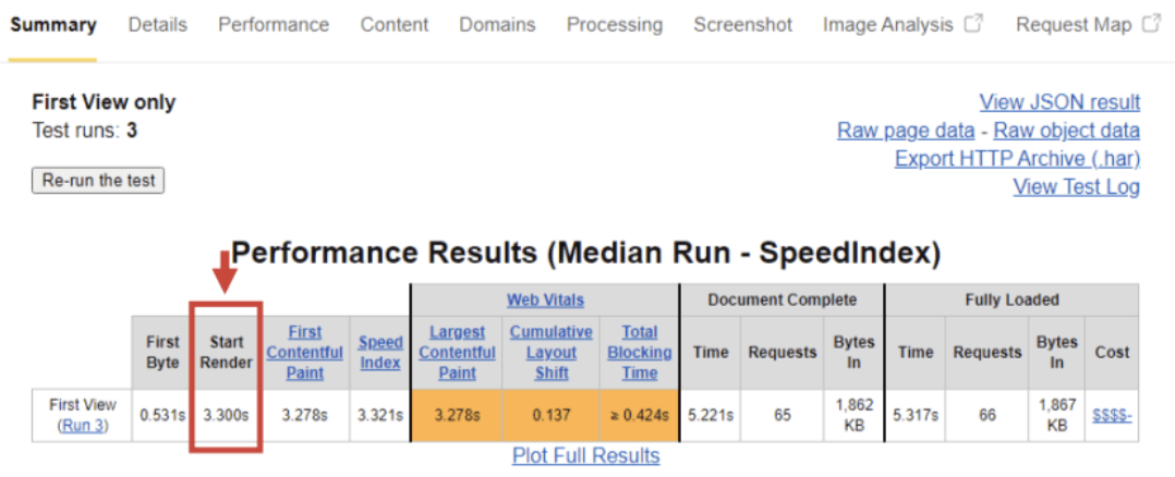
Page loading speed
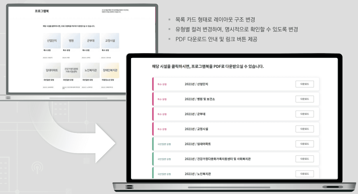
Redesigned Navigation Layout
Increased Accessibility
I improved navigation issue by redesigning the layout with list cards, enhancing visual readability with color-coded categories.
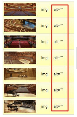
I addressed various elements that were not in compliance with the Web Content Accessibility Guidelines (WCAG) 2.1 (released in 2018), including keyboard navigation, alt text, and color contrast.
alt text
Iteration 2
Iteration 1
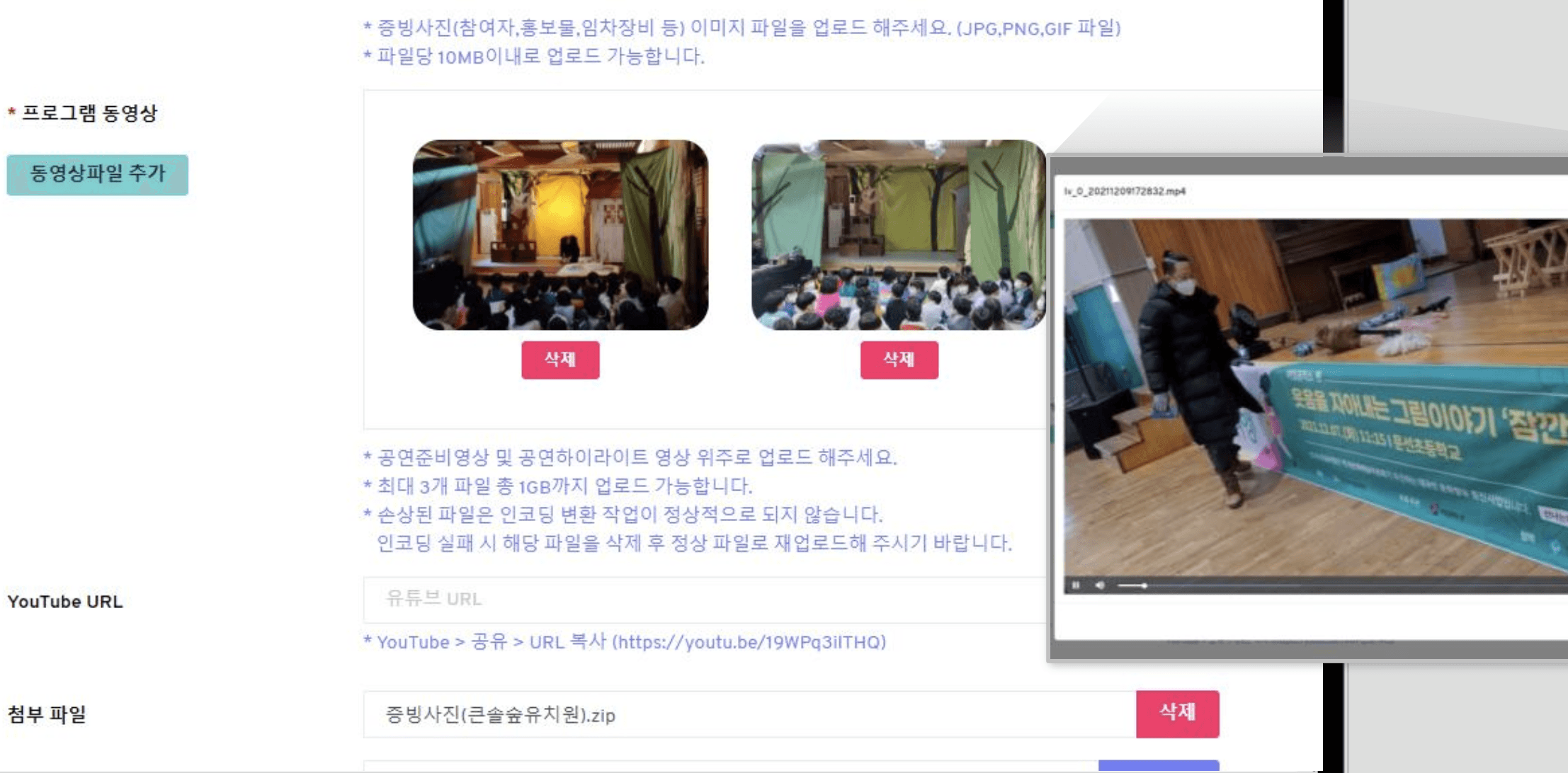
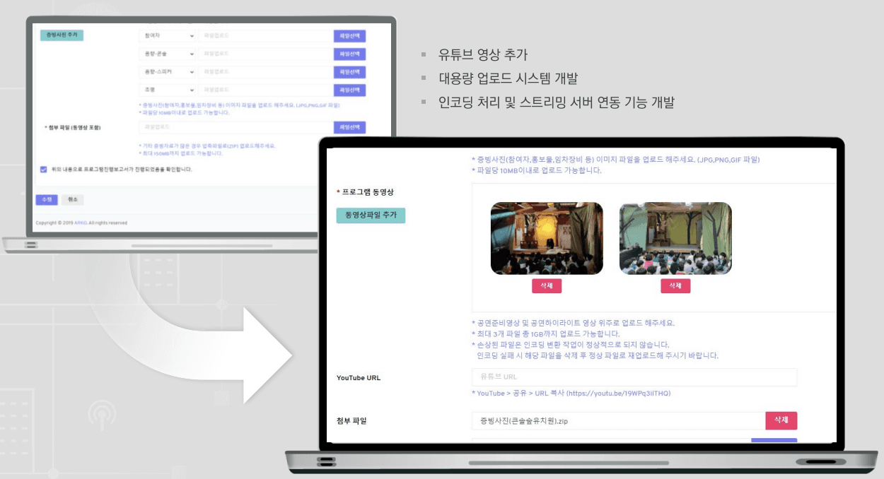
Implemented Video Features
I designed and developed a layout for uploading YouTube videos, making it easy to preview without uploading separate video files.
Iteration 3
Reflection
